The Greater Twin Cities United Way fights to end poverty and support long-term well being by providing access to food, shelter, healthcare, education and jobs by bringing together the public, private and nonprofit sectors to solve the community's most pressing needs. They provide a great service to the underserved members of the community and it was a privilege to work on a project for such a honerable organization.
Introduction
The Greater Twin Cities United Way approached our research team to evaluate the usability of their current website, and determine how effective it was of demonstrating their unique value to the Twin Cities community. The goals of the website are to invite users to learn more, encourage users to get involved with the GTCUW and provide an easy way to donate money.
The website contains a massive amount of information with very powerful images portraying GTCUW's importance to this community. With all of this information ready to be accessed, the goal was to truly make it accessible; the obstacle was the main navigation bar.
The First Step
The first step in the project was to conduct some internal research. Each member of the research team spent time interacting with the website, trying to accomplish some main goals and noting any pain points encountered on the way. It was found that it was very easy to donate money to GTCUW through the website which is very good because that is one of the primary goals of the organization; however if you wanted to get involved at any level beyond required some serious work. It was clear the website contained a lot of information, but finding the information you were looking for was like playing a game of hide and seek.
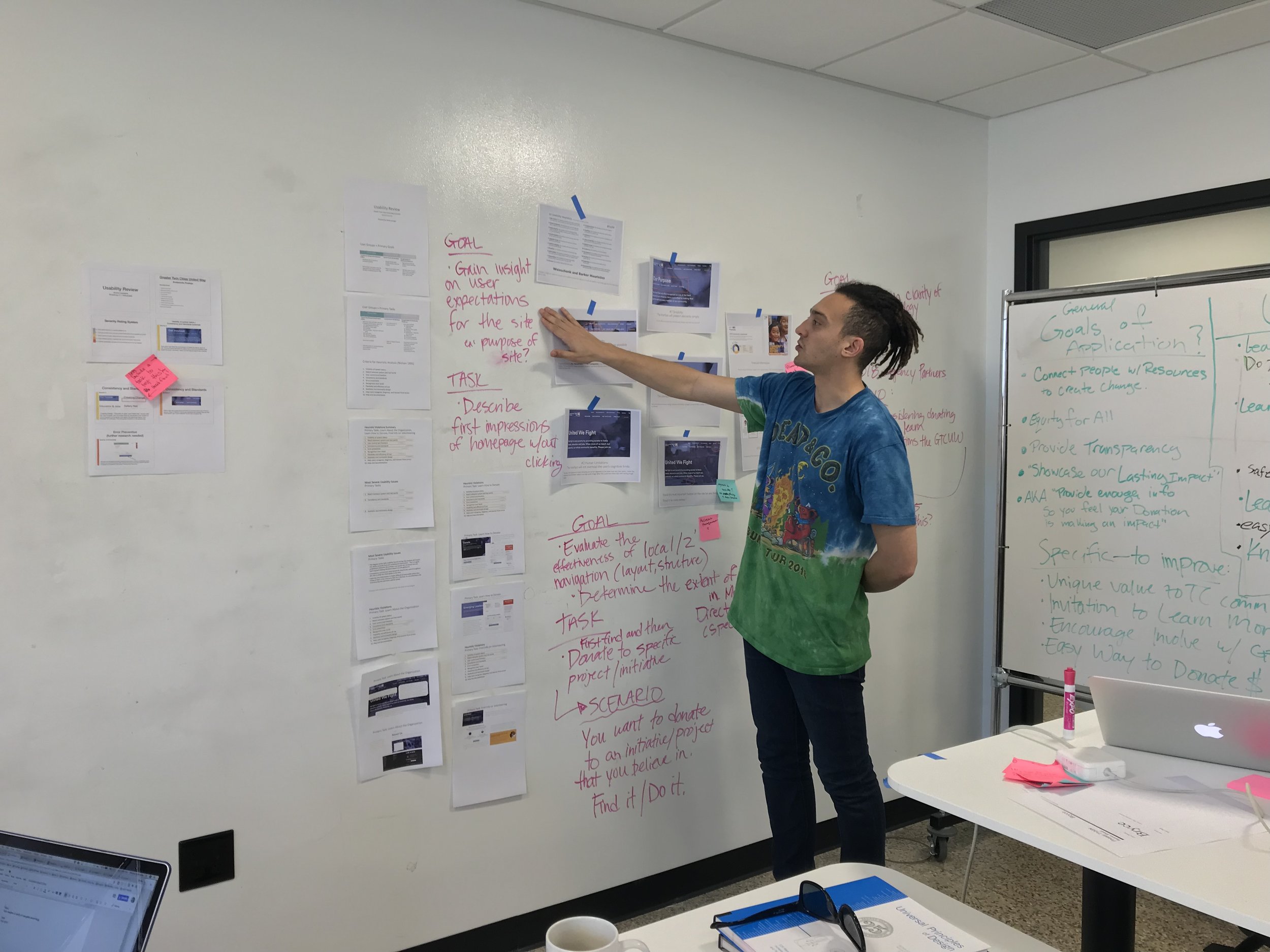
The research team compiled a list of goals that we wanted to discover heading into formal in person usability tests.
Gain insight on the user's expectations for the website
Gain insight on the clarity of the main navigation terminology
Evaluate the effectiveness of the navigation structure and layout
Evaluate the difficulty of making a donation to a specific initiative
Evaluate the difficulty of getting involved with a specific initiative


Into the Lab
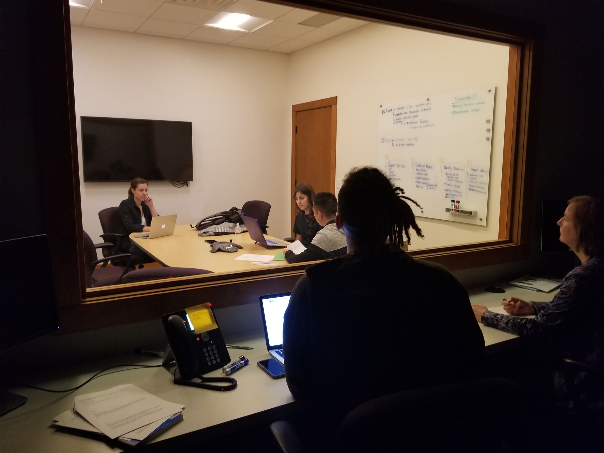
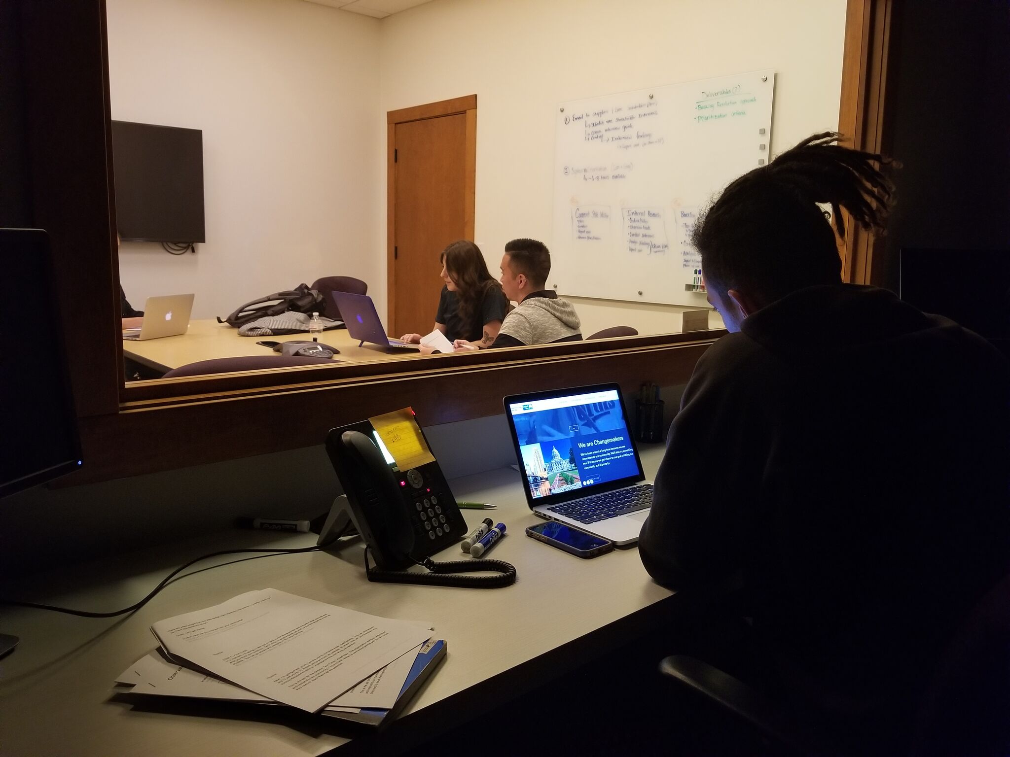
The research team then conducted some formal usability testing. Thanks to the kind people at Fathom Consulting we had a top class facility to conduct our research. We conducted 3 usability tests in person at Fathom Consulting and 6 usability tests in a remote setting using appear.in to video chat with the participants.
The tests highlighted the pain points we had identified in our internal research, and also introduced some new interesting ideas for the website.
The most significant of our usability findings was that not a single one of our 9 participants was able to find the list of outside organizations that the United Way funds. This information was located in the "About" section of the website and managed to elude 9 participants instructed to find it.


The research team compiled our notes and began coming up with the right direction to take this navigational problem.
Finding The (United) Way
Picture above: Navigation bar with two full layers of options
Picture above: The Navigation bar after it has cocealed the top half of options
The main issue causing users so much trouble navigating the website was the layout and language used in the navigation bar located at the top of the screen. The buttons on the navigation bar were split into two layers, but when the user would scroll down the page the navigation bar split in half, concealing the upper line of information. When half of the buttons on the navigation bar disappeared the user was left unable to find the page containing the information they were looking for.


Reporting
A report containing all of the findings was created and provided to The Greater Twin Cities United Way. This report highlighted the results of our usability tests as well as provided solutions to improve the websites overall functionality and usability. These suggestions were centered on condensing the navigation bar, keeping its structure consistent no matter where the user was on the website, and changing certain language to better communicate with the user.
Creating a Better Map
Prototype created in Axure RP8
After presenting our findings to The Greater Twin Cities United Way development team, the green light was given to make some prototypes to solve this issue. The solution was to redesign the navigation bar condensing the information into one line; so when the user scrolled down the page the navigation bar didn't conceal any important information.
This was done by creating an "About Us" dropdown list which contained the "Our Work" and "Our Purpose" pages within it. This created one dropdown list that contained all the information a user would want to access about GTCUW.
Similarly, a "Get Involved" dropdown list was created to contain all the information a user would need in order to, well, get involved with any of GTCUW's many programs and giving communities.


